Ahh “OHH,” a marathon project of which I can’t capture the hundreds of hours spent. This is the first process entry I have done, and it’s bound to be one of the biggest. Don’t take marathon as a negative, I like running for especially long distances. But there is no denying the scope, completion of this website was a fantastic feat for everyone involved.
Reputably the oldest landscape architecture and city planning firm in the nation, Ochsner Hare & Hare had their centennial approaching. 2010 marked 100 years of history for the group, and they wanted to christen their next 100 in a way that demonstrated a mature forward looking firm who realized what has kept them relevant for so long. They value their past, so that’s were we started.
The university system in Missouri has over 13,000 drawings and designs attributed to OHH in Kansas City, I’m not sure how much more in Columbia. We visited and flipped through some of those in Kansas City, and were struck by the pain-staking detail of the hand drawn plans. Gorgeous ink and watercolor landscapes necessary at the time were also iconic of the time. If you’re familiar with Kansas City, landmarks such as Nelson Atkins Museum of Art, Loose Park, Liberty Memorial, and Country Club Plaza, just to name a few, were planned by Hare & Hare (later to be Ochsner Hare & Hare).
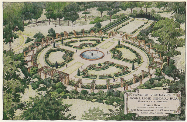
Hand drawn plans for the rose garden in Loose Park, Kansas City.
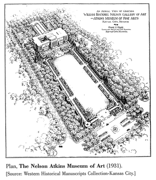
Hand drawn plans for Nelson Atkins, Kansas City.
We poured over their material, current and past, as we tried to help define the modern Ochsner Hare & Hare. Two main things stuck with us. Their desks were messy! Big wooden topped desks in an area they called “the pit” was where the crew operated. After several visits to the office we were familiar with the shuffled papers, drawings, and notes that made up the OHH employee. Their process and work space seemed to echo the balance needed when considering the likewise organic needs of order, flow, and interaction in outdoor environments. We would keep it in mind.
Of course the second major point that stuck in our innocent little heads was the hand drawn plans we saw in the archive. It was just too great of an art asset not to be considered. Furthermore, hand drawing was still a big part of modern OHH, so it was a clear connection. The current staff focused on classic principals of process based design, and what better medium to speak to fundamentals and process than drawing?
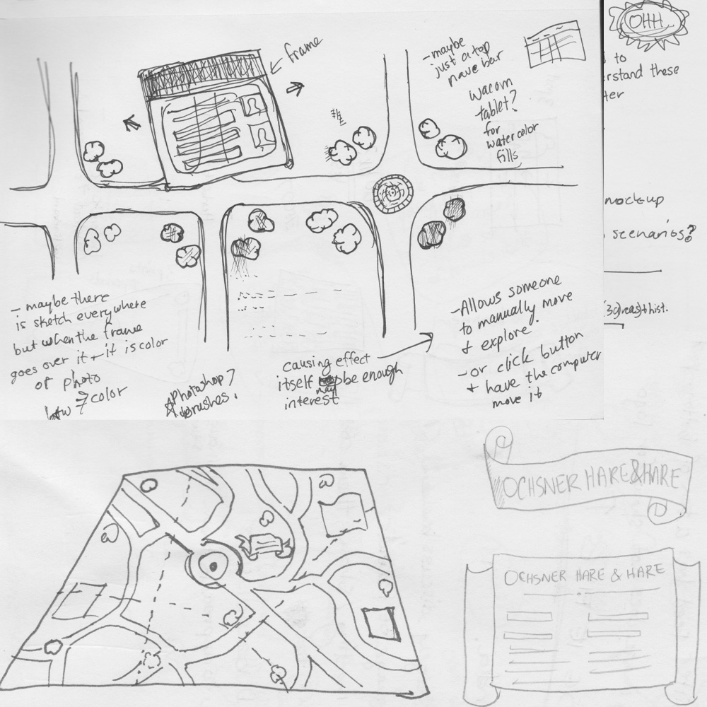
JLSA early brainstorming and sketching for the website design.
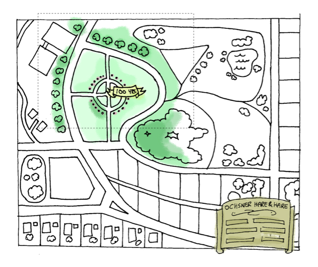
Website design map idea with watercolor.
Over meetings and talks, the final concept we landed with was an interactive map. OHH had expressed issues with people understanding the true scope of their work, so we proposed using a singular hand drawn map that represented every piece of their service. It was to be an á la carte menu of sorts. Users could explore the entire map seeing only a portion at a time. When you visited new parts of the map it triggered the filling of watercolor on what was formerly black and white. If the user was uncomfortable with unconventional mouse movement and interaction the classic crest in the bottom right was also available for more traditional menu navigation (this type of mark was also a historical reference).
The types of services OHH offered were divided into major categories (representing their full range) and then represented as different parts on the map. The idea was exciting, so we went to testing the technology and design interaction.
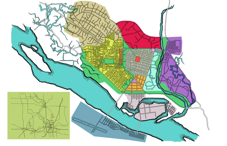
Map and categories
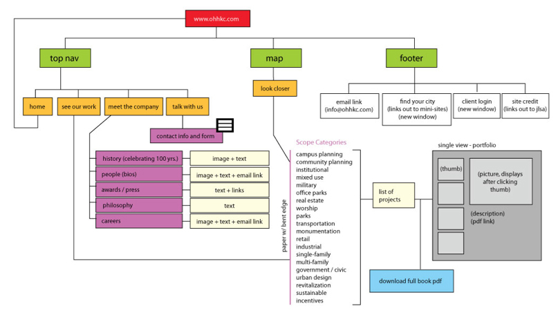
Initial website architecture
We prototyped how something like watercolor could dynamically appear with the user controlling it. Being overly processor intensive for the common computer was a huge concern, and it eventually led us to scratch the interaction. We did not however scratch the watercolor idea, and you will see how we found a solution soon. Most of our concerns now lay in balancing an engaging user experience without overstepping the huge informational needs of the website.
The á la carte map was a fun idea, but it wasn’t communicating as clearly as a picture – several pictures in fact. Showing OHH portfolio images, scattering several of them on a “desk,” clearly communicated more to people what OHH did than a single map. We started pulling randomly from finished projects and displaying different images every time you visited. It opened up an interesting way to always see more of their huge body of work, and the busy planners and designers at OHH didn’t have to keep updating their home page for things to seem fresh.
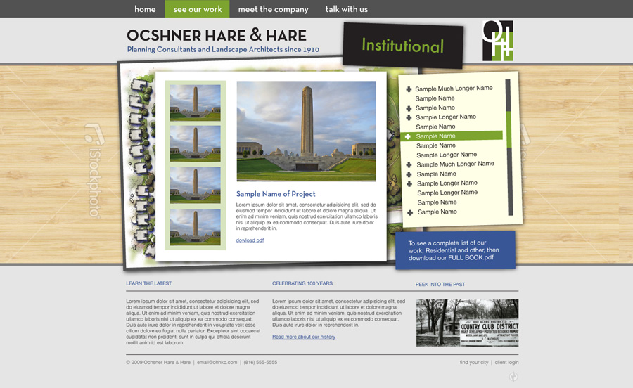
Our first explorations with the messy desk. Many things would still change.
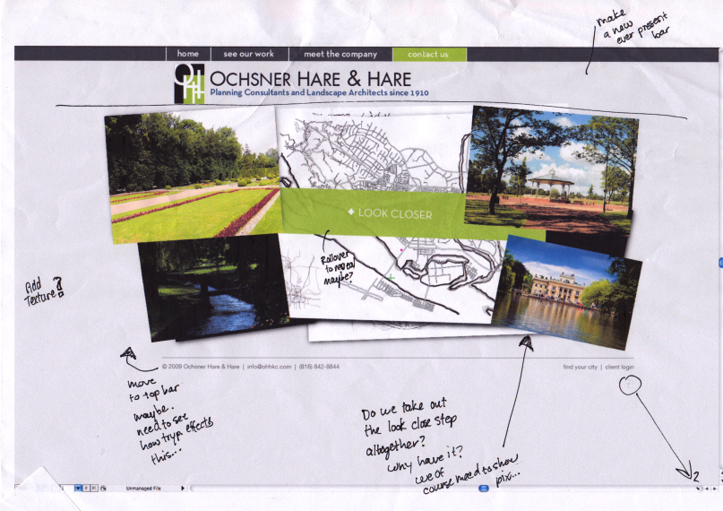
Process notes, reacting and revising the website design
Just as the “messy desk” was playing a bigger role, the hand drawn plans still had a major part to play. The watercolor idea spiked our creative punch, and we had just the right bowl. Instead of introducing watercolor dynamically through user-interaction, we animated it revealing after a click. OHH had broken down their offerings into 4 major categories, and each category was represented by a single hand drawn map. All work could fall into these groups, and in turn they helped communicate the full range of services offered. Was that confusing? It’s probably worth just looking at the website. It all served to better facilitate a lot of information and still be engaging in a way that supported the personality and practice of OHH.
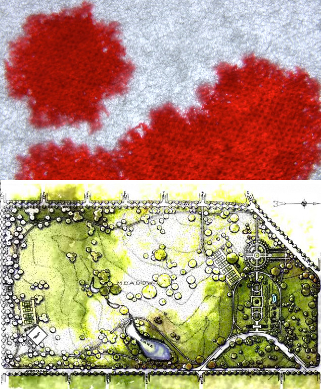
We turned ink dropping on cloth into watercolor dropping onto a plan.
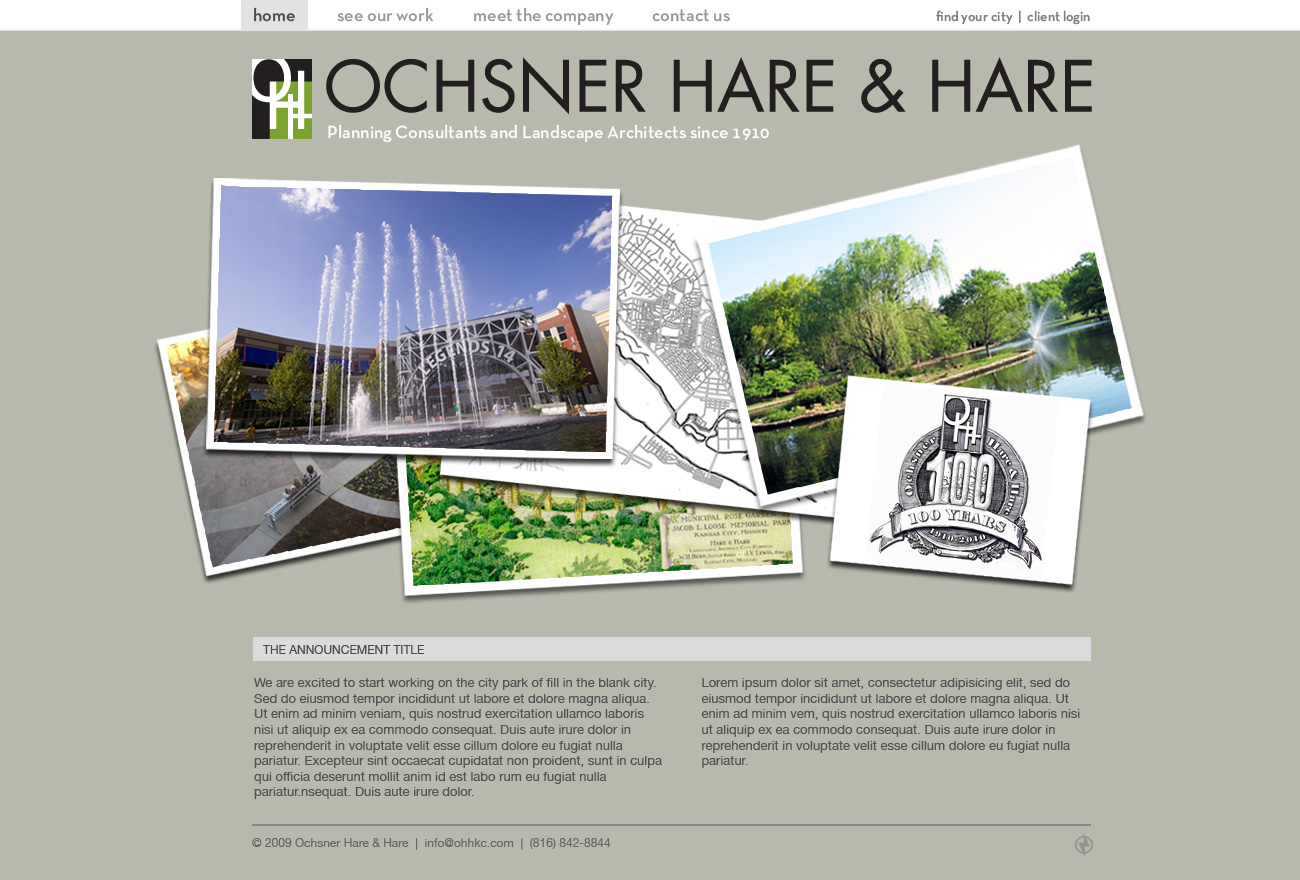
The final website design on the home screen.
I want to at least mention the co-efforts of Shannon and Cody on the OHH side of things. They were great to work with and really important to this project. The website is still currently being polished and tested. We are extremely happy to see it online and working, and I can’t wait to check back in 6 months to see how it has evolved. The entire website has a content management system so that OHH can change/add any information they want. Thanks for reading this, and here’s to this project being cool in 100 years.
Cheers!
– Josh
Visit our portfolio here, or visit this website at www.ohhkc.com

