JLSA Logo

Stuff that does stuff

Posted in News on by David Cecil

Fetch Website Design, Development, and Branding - Johnny Lightning Strikes Again

One of the most important questions we answer for our clients is how creative services can be leveraged to achieve their objectives. They know what an agency does, but they want to know what an agency can do for them. Since a lot of creative is subjective, we often find ourselves talking about intangible benefits — customer loyalty, emotional connection, and trust. Intangible benefits aren’t the whole story, however. Creative services, especially web and application development, can also provide a business with functional tools that make life easier.

READ MORE →

Do Right Strategy, Process & Philosophy - Johnny Lightning Strikes

Do right

Our motto at Johnny Lightning Strikes Again is “do right,” and it is founded on three things that we believe to be true:

1) The purpose of creative has to be to help a business achieve their ultimate goal.

2) To do this, the work can’t just be good — it has to be right (and there is a huge difference).

3) The biggest enemy of doing the right work is making strategic decisions prematurely.

This is the foundation of our philosophy and it affects almost everything we do. The most noticeable impact, however, is found in the process we go through from the moment a project with a new or existing client is being considered to its completion. It works in three steps.

READ MORE →

Snow & Co. Logo Branding - Johnny Lightning Strikes Again

In 2010, we were at a poolside event and met an MBA student from a Kansas City college. Since Johnny Lightning Strikes Again is in the business of growing businesses, the conversation naturally turned to a concept for a bar & restaurant that he and a few of his fellow students were considering pursuing. Philosophies were shared, business cards were exchanged, and plans to discuss it over coffee were made. These conversations are always exciting, but they also highlight that there are a lot of hurdles to jump over to go from a concept to opening day.

In this case, there was one thing that made us believe that they had the right stuff to do it, however. They wanted to start with the brand.

READ MORE →

Logo mistakes

Posted in Strategy on by David Cecil

Branding and design aren’t topics normally discussed by media outlets like CNN and BBC. But when Gap rolled out a new logo, found out that everyone hated it, and took it back, that’s exactly what happened.  READ MORE →

Pretty or effective?

Posted in Strategy on by David Cecil

We posted an article a few weeks ago that was called, “Effective or pretty?”  The point of it was to question whether designers had become so focused on being fancy strategic experts that we’ve lost sight of the fact that sometimes it works to just make something look pretty.  We concluded, of course, that you simply have to be focused on both aspects of great design – if something is pretty but not effective, it will fail.  If something is founded in sound strategy, but doesn’t look good, it will fail.

Since the last article reminded us of the value of aesthetics, we thought we’d share a great article that reminds us of why we can’t forget strategy.  Read it here.

To conclude, as a designer and when designing certain websites, your goal cannot just be to make a website aesthetically pleasing, but also to make the functions of your website easier to work with, and to integrate them together to appear as a whole system rather than appear as multiple pieces that do not connect.

With that in mind, we are not saying to eliminate the aesthetics point of design, but rather to keep an even balance of thinking about both. As with design, focusing fully on aesthetics can result with poor user interface results and vice versa.

Effective or pretty?

Posted in Strategy on by David Cecil

We just passed around a great article by Mark Cook, a professor of graphic design at the University of Notre Dame, which questions what the purpose of a graphic designer should be. Here is an excerpt from the full article, which can be read here:

Historically, graphic designers have been commissioned to communicate messages in an attractive and desirable way using a combination of type and image. While this is still very much a part of what we do, the role of ”graphic designer” has become increasingly strategic, resulting in a conscious move away from anything that could be perceived as simply decorative. We have worked hard to hold a seat at the table, and fear that recognizing the persuasion of aesthetics will relegate our professional contributions to that of a technician adorning someone else’s thinking. But perhaps the pendulum has swung too far the other direction.

Our opinion?  Sorry graphic designers – you need to do both.  Great design work needs to communicate the right message to the right people in the right way, AND look great while doing it.  I think this is the point that Mark is making, and it’s a good one – you can’t discount the value of doing something that looks pretty anymore than you can discount the value of doing something that is based on sound brand strategy.

Typography is the “style and appearance of printed matter” and there is a reason that we bore clients to death discussing the brand ramifications of serif and sans serif fonts.  It matters!

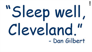
Cavs owner’s letter mocked for Comic Sans font

Comic Sans Font

In my last post, I brought up a question that everyone considering hiring a design firm will inevitably ask themselves – what is the difference between a good designer and a great designer?  I’d like to explore the first differentiator raised by Cameron Moll in his presentation, “Nine skills that separate good and great designers“:

GOOD DESIGNERS DECORATE, GREAT DESIGNERS COMMUNICATE

READ MORE →

I recently came across a presentation by a designer, speaker, and author named Cameron Moll called, “Nine skills that separate good and great designers.” Needless to say, it struck a chord, because it’s a topic that we spend a great deal of time talking and thinking about – both within our agency and with people who are interested in our agency.  Since this blog is a place for us to talk not only about us and our work, but also our industry as a whole, I thought I would take some time to go through the points he makes and do my part to help educate people on the differences between good designers and great designers.

READ MORE →

Some of you may remember the article we posted last month, entitled “Web site or website?”  Well, thanks to an email from a friend of ours at another Kansas City creative agency, we just learned that the AP Style Guide just released this weekend that “website” is now the correct term for a site that exists the World Wide Web.

Since we may be another step closer to putting such a long argument to rest, we thought it was worth a quick addendum to our original post.

Good job AP Style Guide!